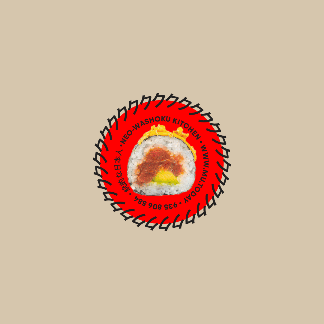
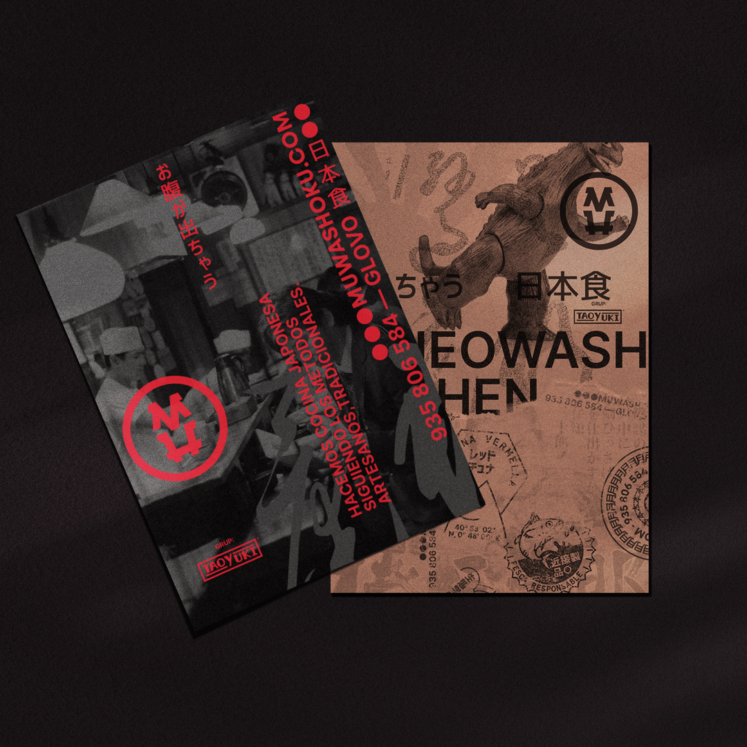
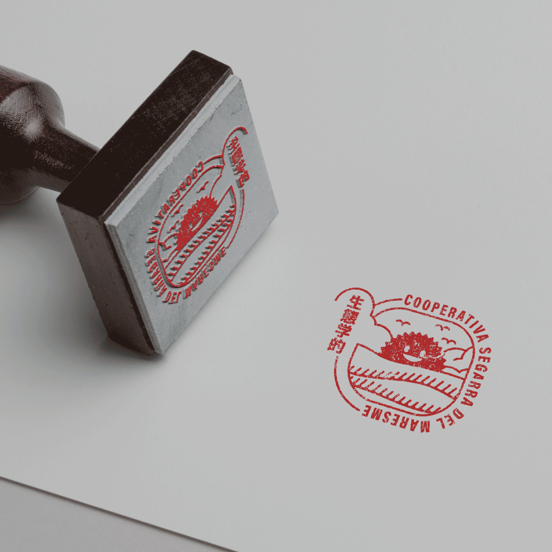
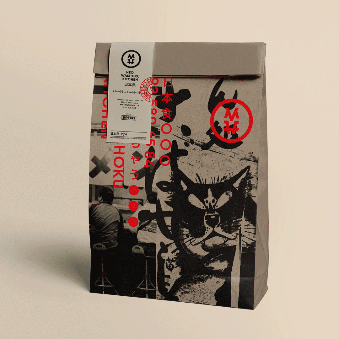
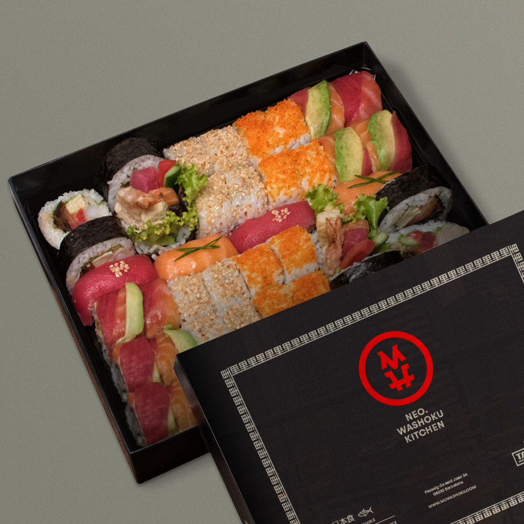
In our brand strategy, we made a deliberate choice to use black and red as key colors to convey elegance, sophistication, and passion, drawing inspiration from the stamps used by Japanese artisans known as “hanko” or “inkan”. These traditional stamping tools symbolize personal identification on important documents and artwork.
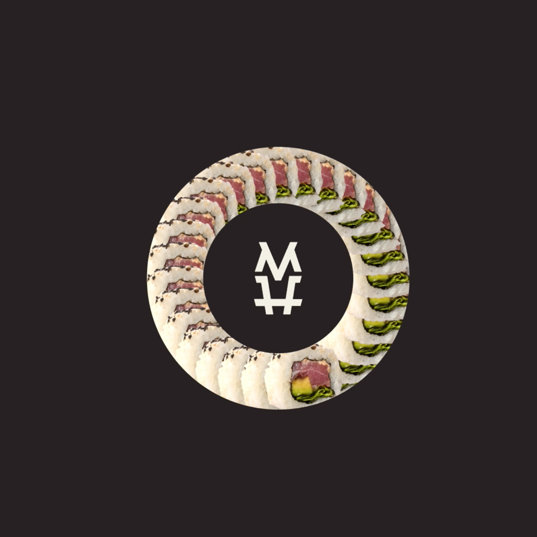
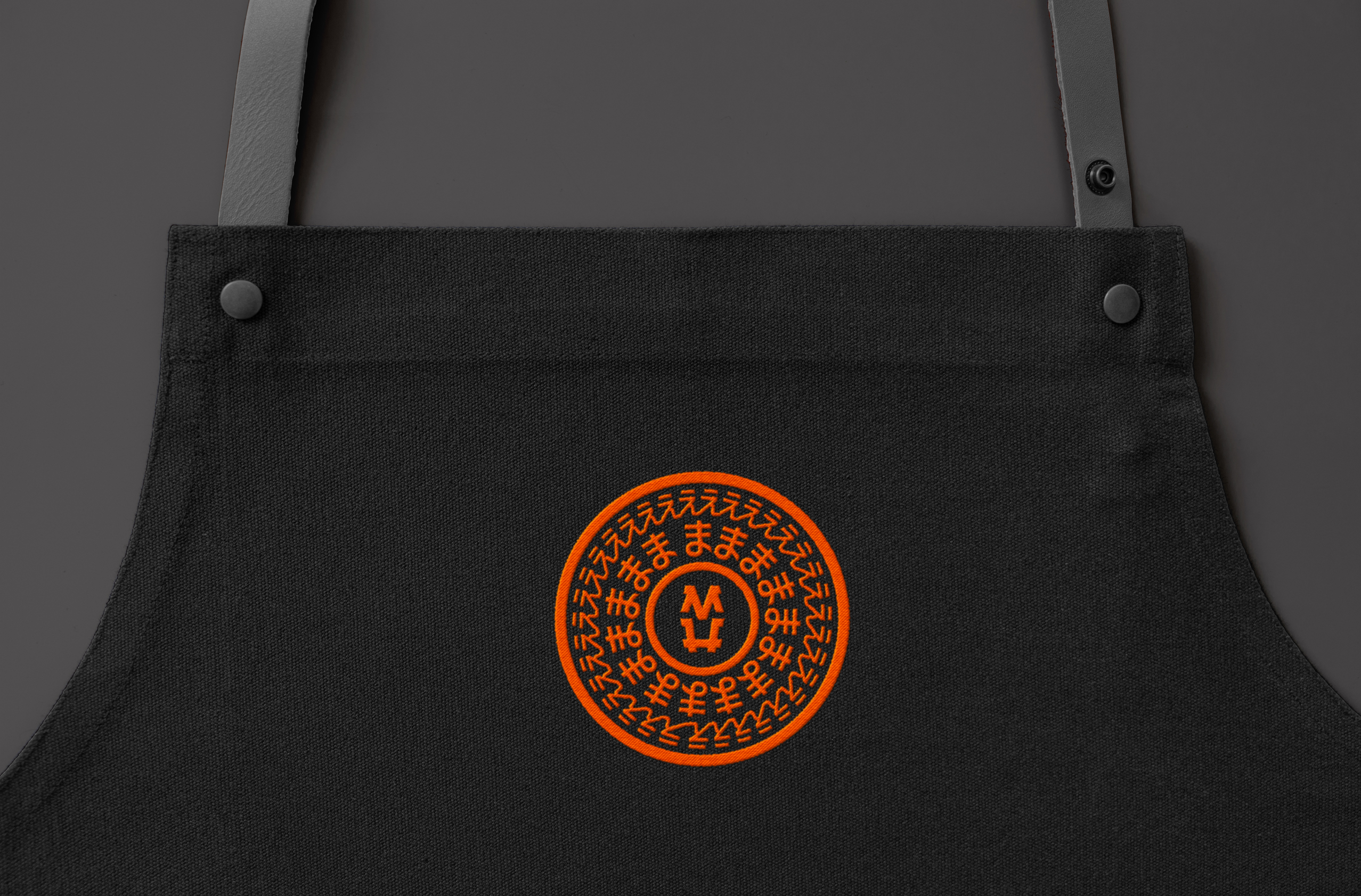
By incorporating this graphic element, our aim is to showcase our commitment to culinary craftsmanship and meticulous attention to detail. The MU logo’s minimalist design features stylized Japanese characters, reflecting the elegance and precision that are synonymous with Japanese culture.
In our packaging and brand applications, we carefully balance the use of black and red, complemented by representative images of both traditional and contemporary Japanese culture. This combination creates a harmonious visual representation that embodies the essence of our brand.